Inspiration is the breathing step in which air fills the lungs. It’s also an inner movement that leads to doing and acting. This enthusiasm, creative breath, animates the writer, the artist, the researcher… Other are often its source. Inspiration elevates and brings us back to basics.
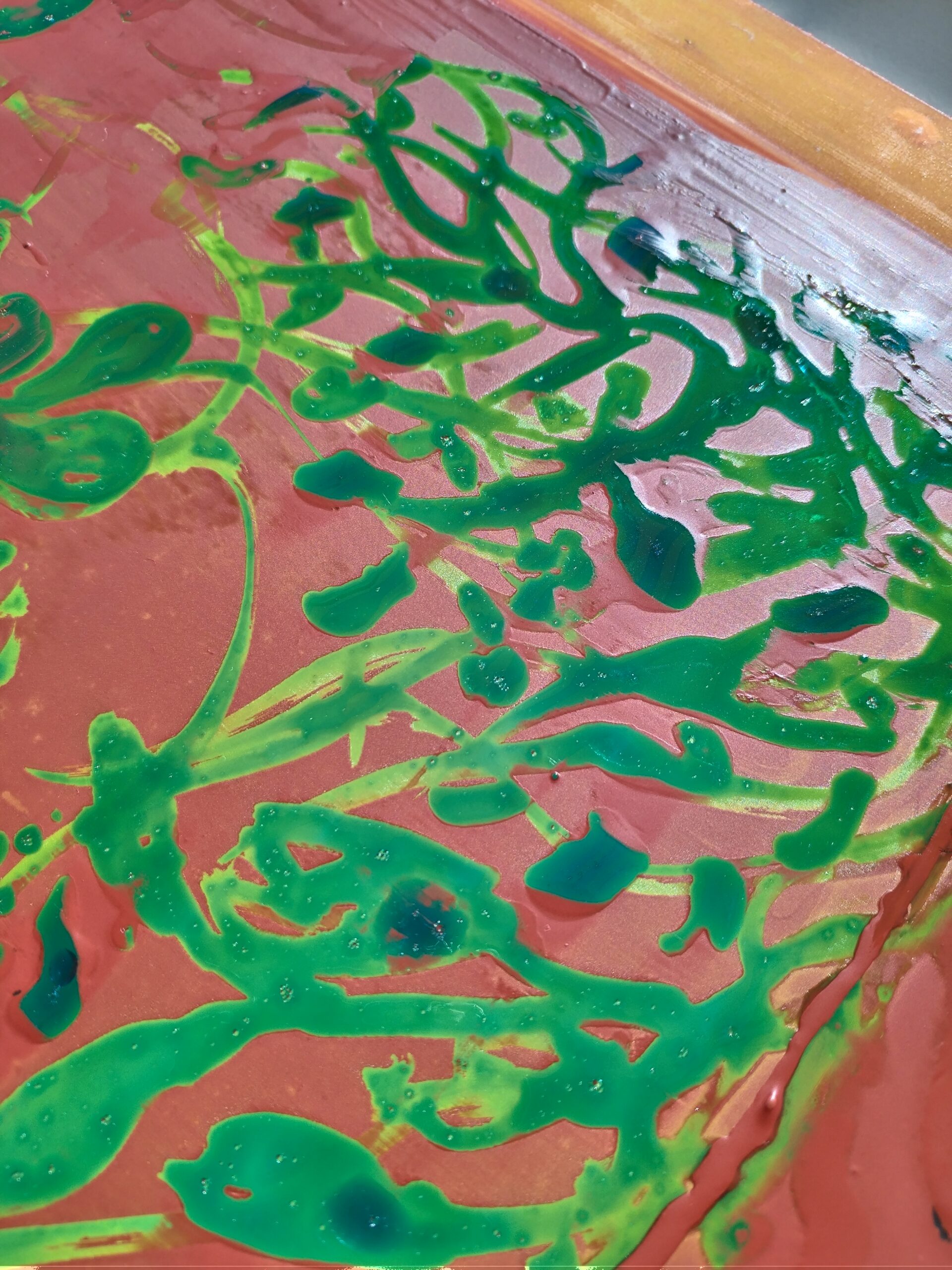
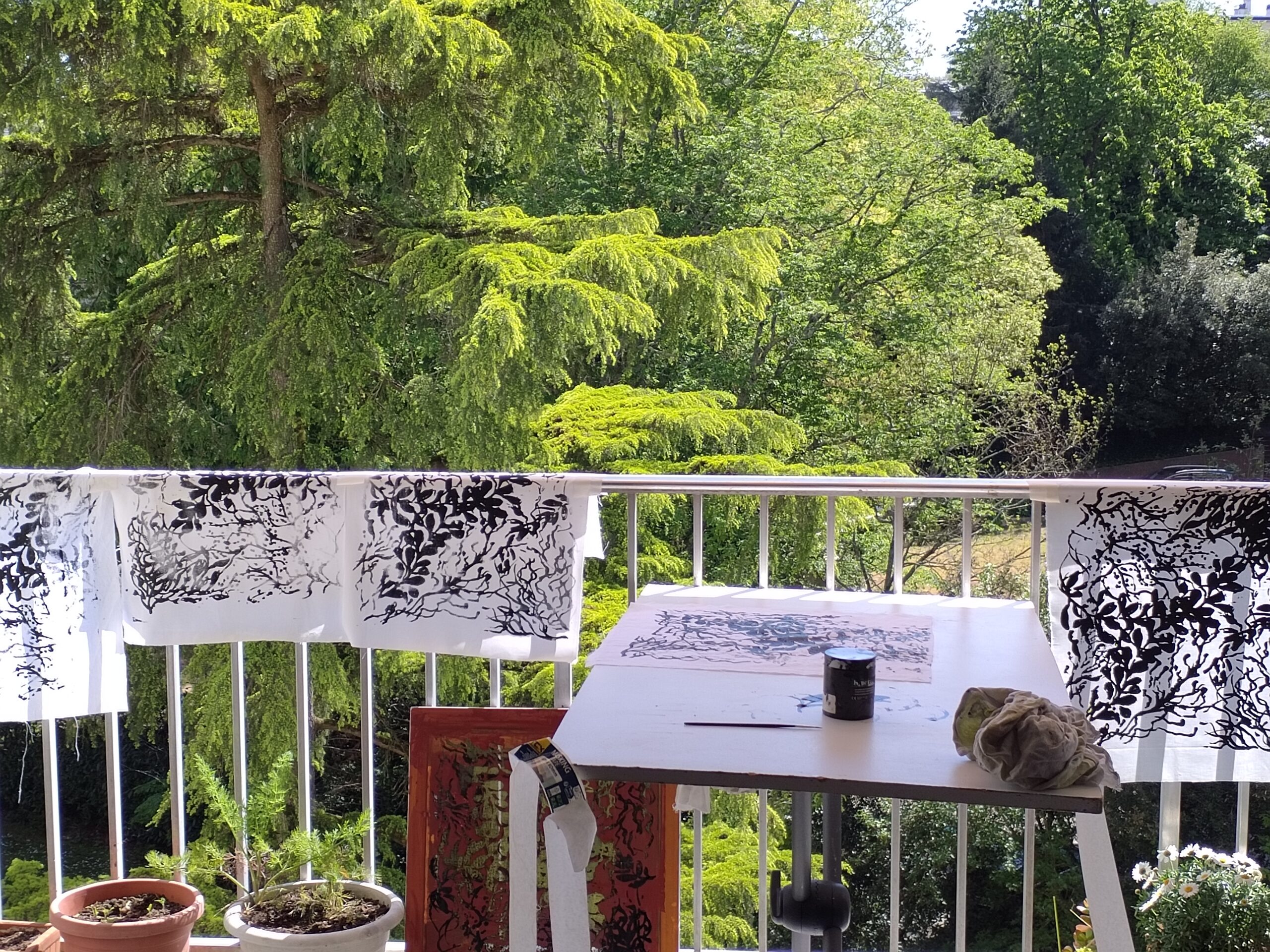
It all starts with the drawing! Using fine or broader brushes, I apply the drawing fluid directly to the mesh to create my design. Once the drawing is complete, I let it dry thoroughly. Next, I apply the screen filler using a squeegee to block out the areas around the design. Once dry, the screen is ready for the next step.
2. Revealing the Design
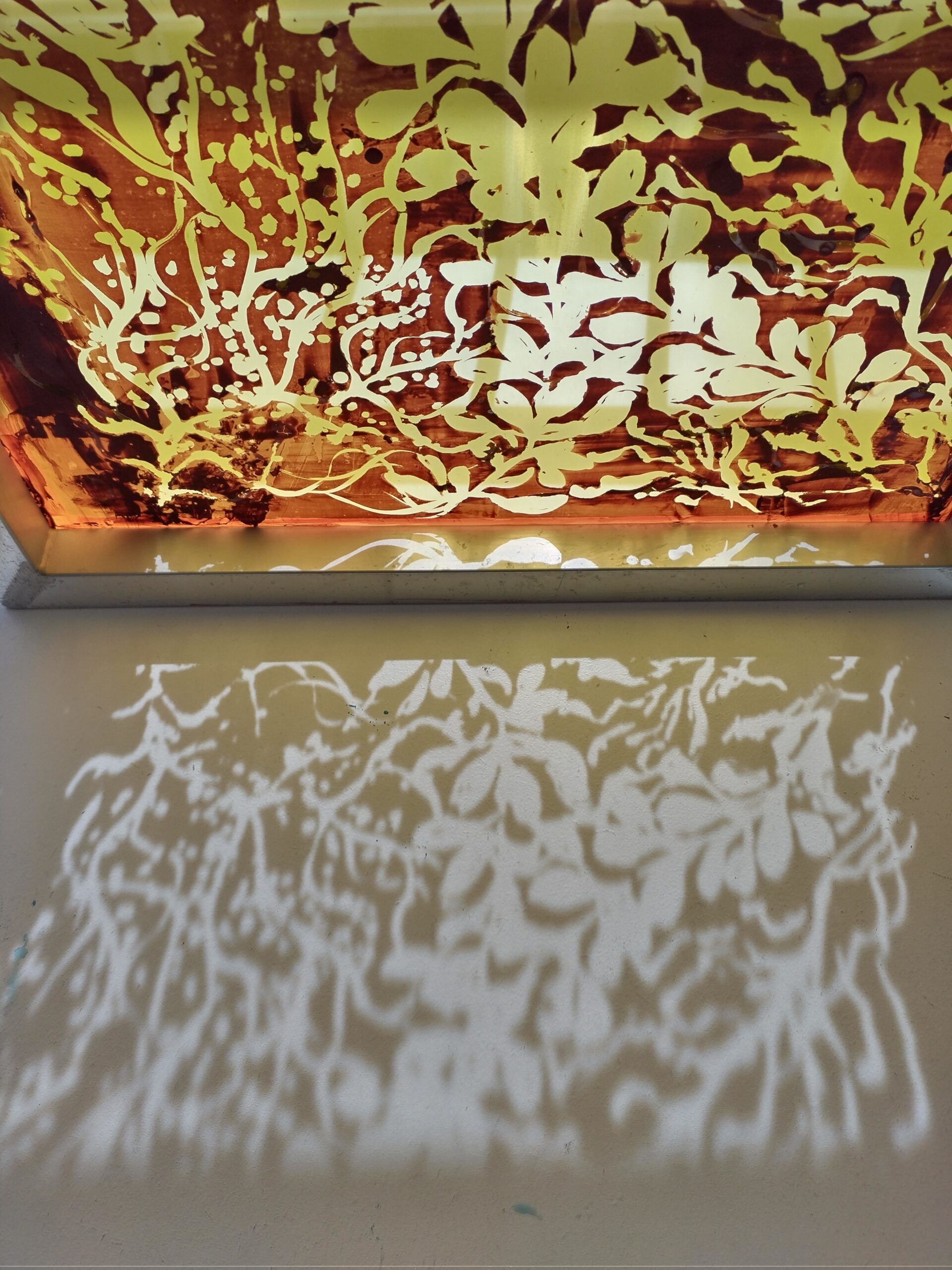
Time to rinse! The water dissolves the drawing fluid, opening up the areas where the design was drawn, while the screen filler remains in place across the rest of the mesh. After one final drying session, the screen is ready to print, without the need for any exposure.
3. Printing Time
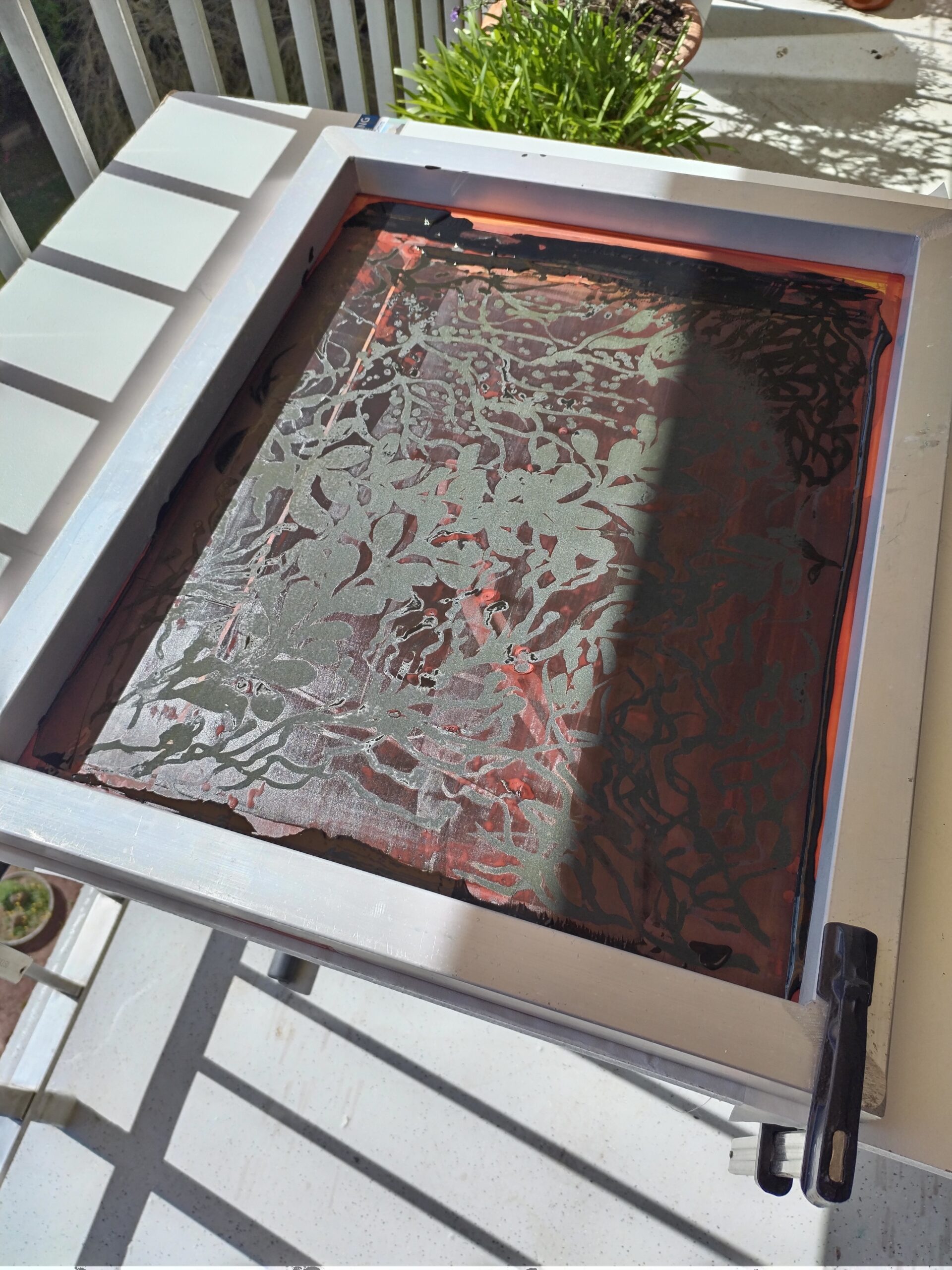
I place a little ink on the screen, then pull it across the mesh with a squeegee, applying even pressure. All that’s left is to lift the frame and reveal the result! The first prints help me fine-tune my technique, adjust the amount of ink, and experiment with different papers and colours.
Experiment, Observe, Repeat
Screen printing requires a little patience and a few attempts, but that’s also what makes it so interesting: every print holds a little surprise. It’s a lovely way to explore drawing through a different medium and let creativity breathe some fresh air!
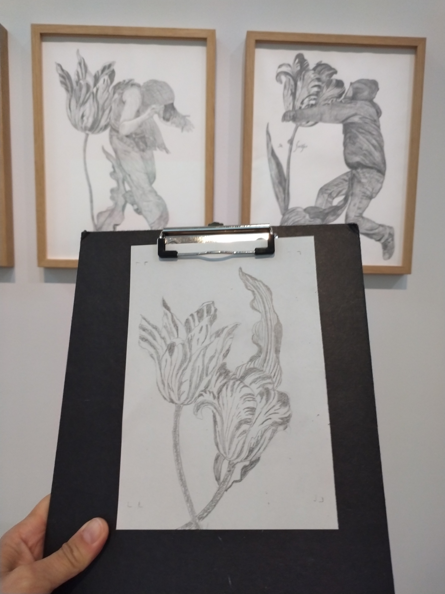
In the morning, we began by drawing directly in front of the artworks. I chose two tulips inspired by Jean-Baptiste Ganne’s graphite drawings from his Windhandel series (Amsterdam 1637 / Athens 2008), which draws parallels between the first tulip bulb speculative crisis in the 17th century and contemporary crises.
This series particularly moved me. The artist juxtaposes 17th-century Dutch prints depicting tulips with photographs of the 2008 Athens student riots. Through this unexpected pairing, he draws a parallel between the famous “tulip mania” of 1637—often considered one of the first speculative bubbles in history—and contemporary crises. A powerful work, where flowers and human figures intertwine to question the economic, political, and social mechanisms of our societies.
Printmaking in the graphic arts workshop
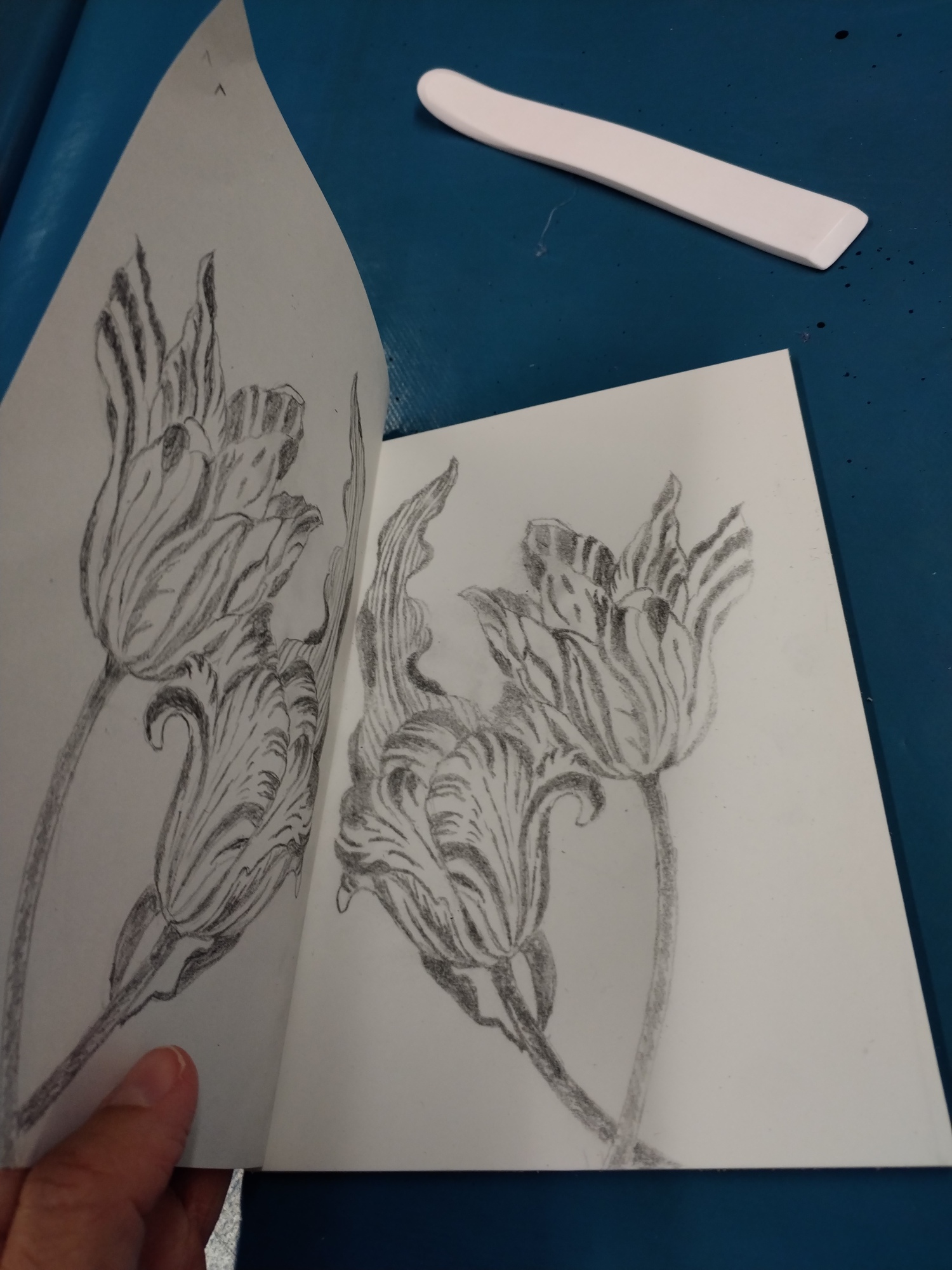
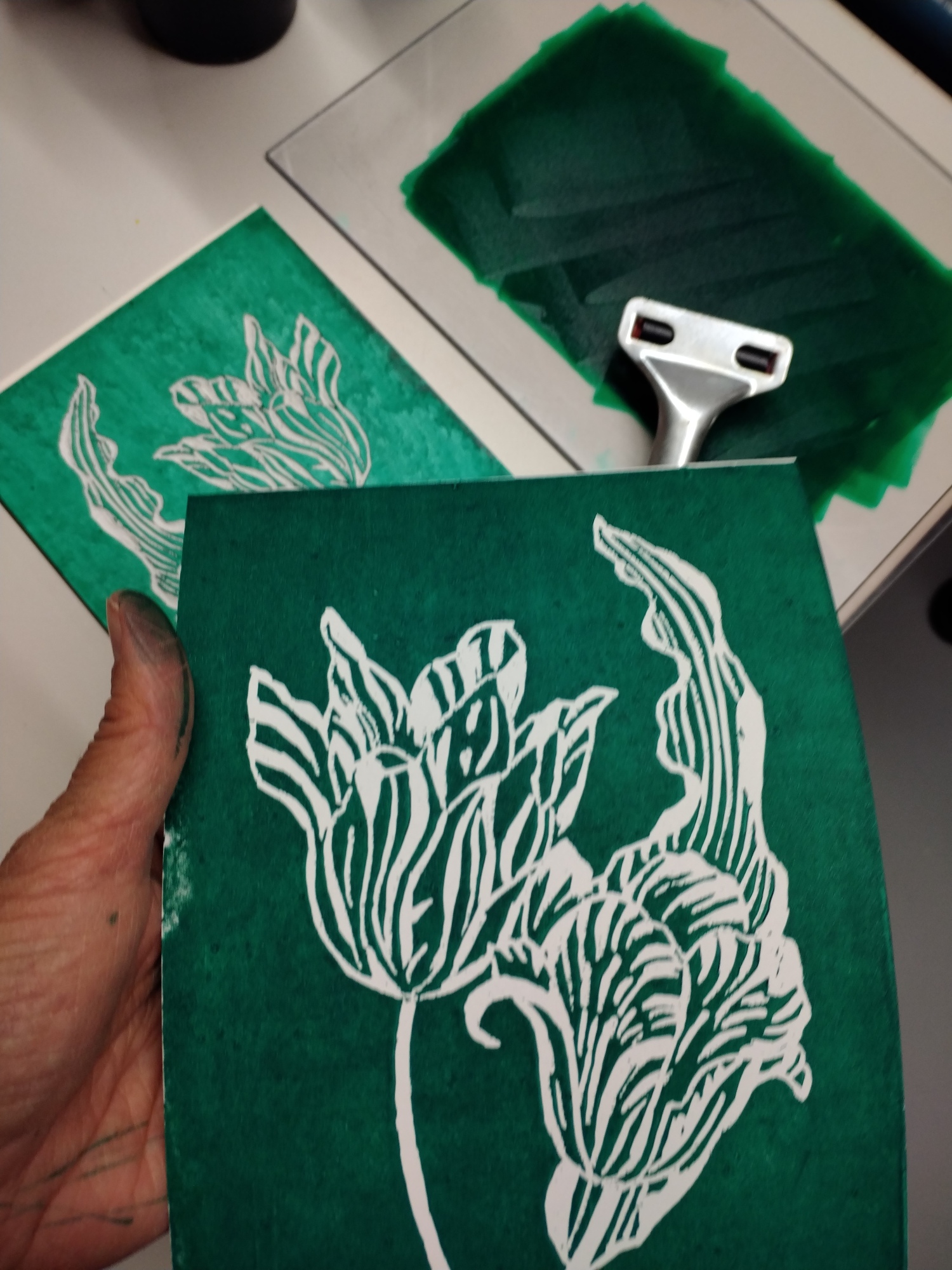
The afternoon was devoted to linocut printing on rubber blocks, after transferring my drawing in grease pencil (4B).
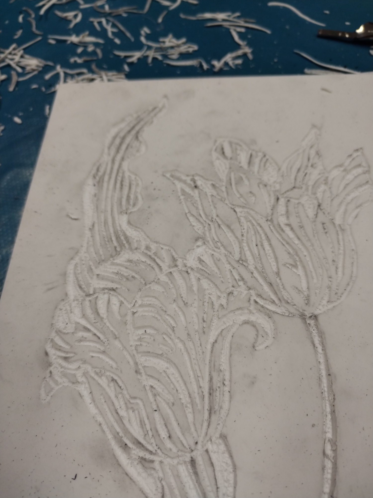
Next comes my favorite step: engraving. Using gouges of different sizes, I carved into the material, taking care to preserve the delicate lines of the tulips. Every stroke counts, because what is removed cannot be corrected.
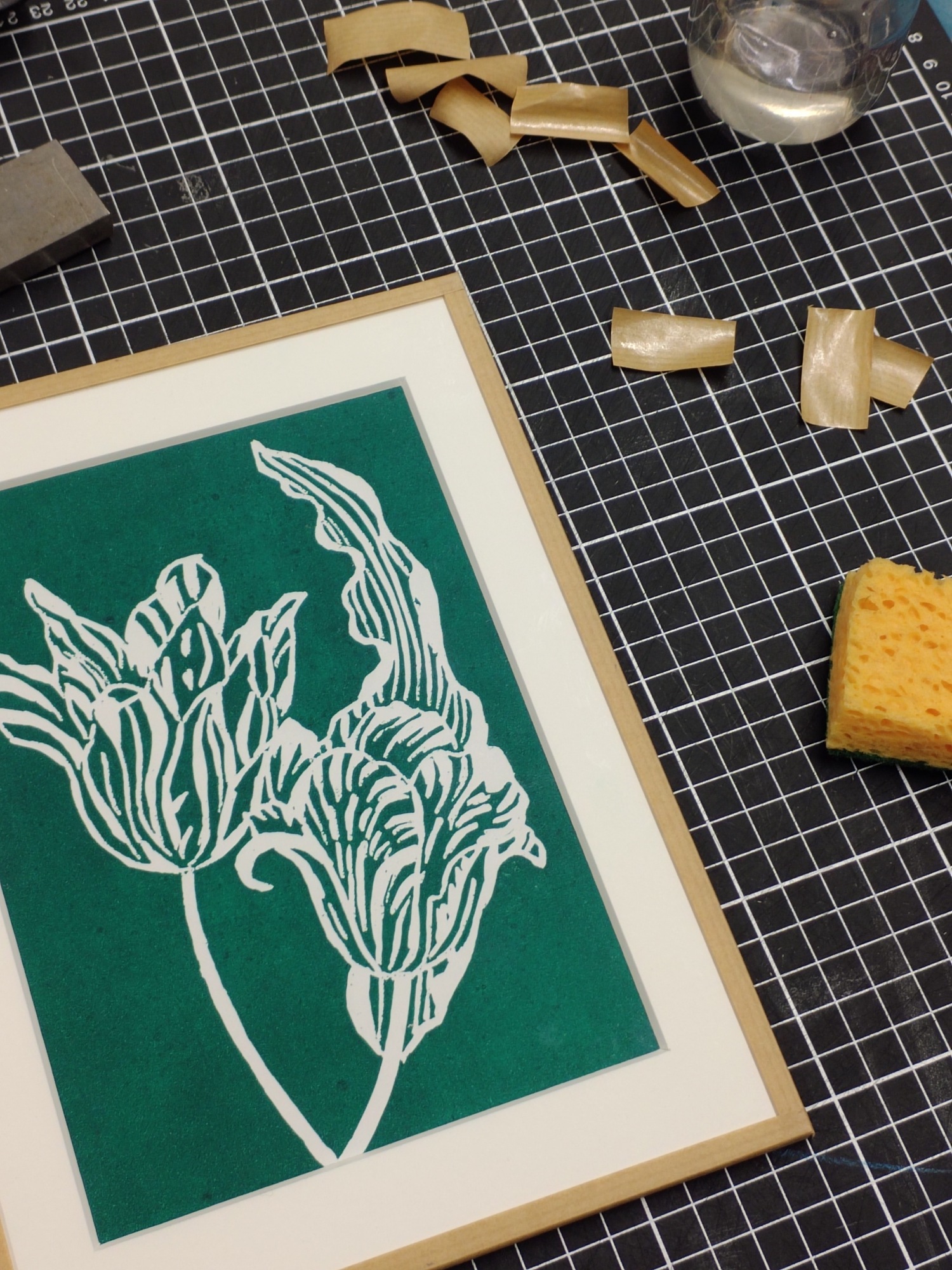
Once the plate was ready, we proceeded with the printing using linocut inks on smooth paper. I made several tests: some in green, others with gradient effects. It’s always a magical moment to discover the result of the first print, a blend of technical mastery and a touch of the unexpected.
Museum-style framing
On Sunday, we explored framing techniques used for the preservation of works on paper: assembling the mat, Japanese paper hinges, gummed kraft paper, and mounting under glass.
This workshop would not have been as enriching without the guidance of Salomé, curator of the graphic arts department, and Corinne, public outreach coordinator at the Nantes Museum of Fine Arts. Their expertise and generosity allowed us to better understand not only the artistic techniques, but also all the conservation, mounting, and installation work carried out behind the scenes.
This year, I wanted to learn more about screen printing, this time on textiles, under the guidance of Clémence Régnier, having previously experimented with it on paper at Antonin + Margaux, and then with Pierre from Atelier Parades. The course began with an introduction to the various textile printing techniques and types of fibres. Screen printing, which emerged between the two world wars, remains one of the most accessible methods for creating prototypes or small artisanal runs. It differs from sublimation (suitable for synthetic fibres), flex/flock (more decorative) and digital printing (more water-efficient but costly to maintain). What particularly appealed to me about screen printing is precisely the possibility of working with natural fibres and achieving a rich, sophisticated and, above all, artisanal finish!
Patterns & colours
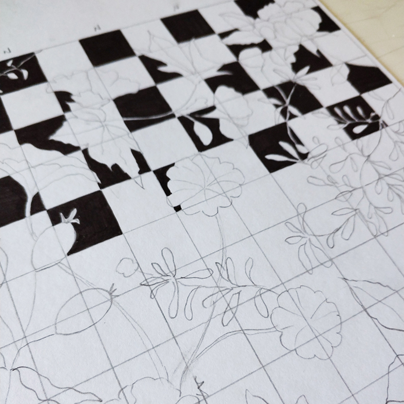
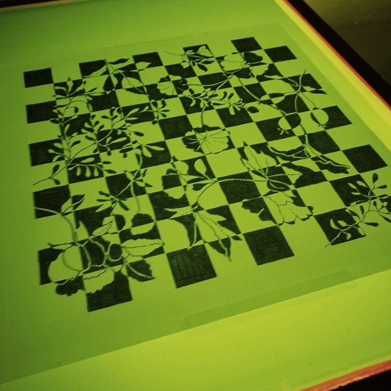
For this workshop, I prepared two separate projects in advance. For the single-colour pattern, I drew a floral checkerboard design by hand using a fine-tip marker and then scanned it. Before printing, I prepared this design in Photoshop: as a bitmap (black and white, output at 150 dpi) to ensure sharp, usable outlines for the exposure. I also thickened certain lines that were too fine (< 1 pixel) to ensure they would print clearly.
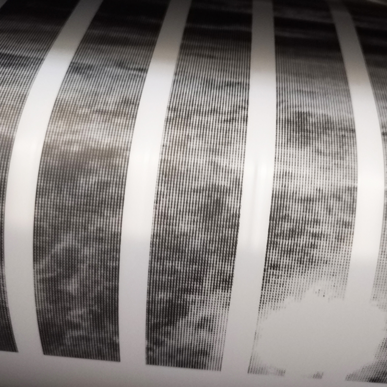
For the three-colour design, I chose a photo taken by the sea. After converting it to greyscale in Photoshop, I then converted it into halftone screens. You need to create a separate layer for each colour and add registration marks so that the plates can be aligned correctly. For this project, I therefore created three layers: one for the transparent pink ink, one for the opaque silver ink, and one for the black halftone screen. The line count, which corresponds to the number of dots per inch, was determined by the mesh size used: for a 77-mesh screen, I worked with a line count of 25.
The mesh size of the screen does indeed play a key role: the tighter the mesh, the less ink passes through. I used a 54-mesh screen for the first design (ideal for solid colours), and a 77-mesh screen for the second, which required greater precision due to its intricate pattern. The next one on silk will require a 90-mesh screen – watch this space…
From the workshop to the finished products!
Once the stencils were ready, we exposed the frames, then rinsed and dried the screens before moving on to textile printing.
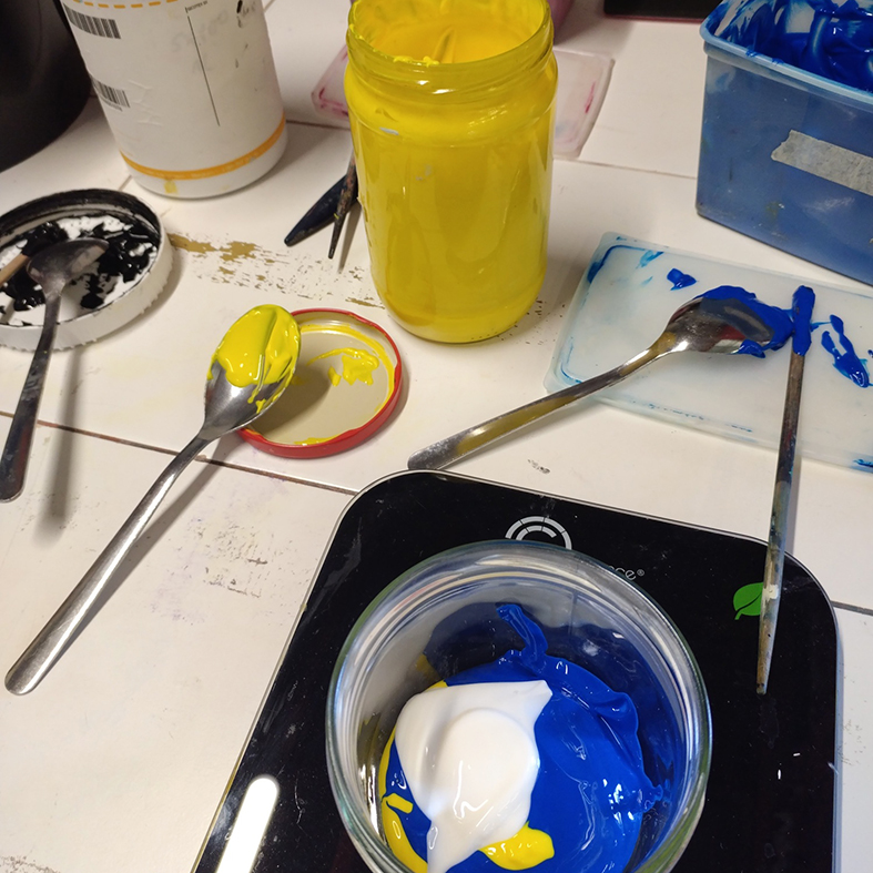
At the same time, like lab technicians, we tested our colours down to the last gram to achieve the desired shade…
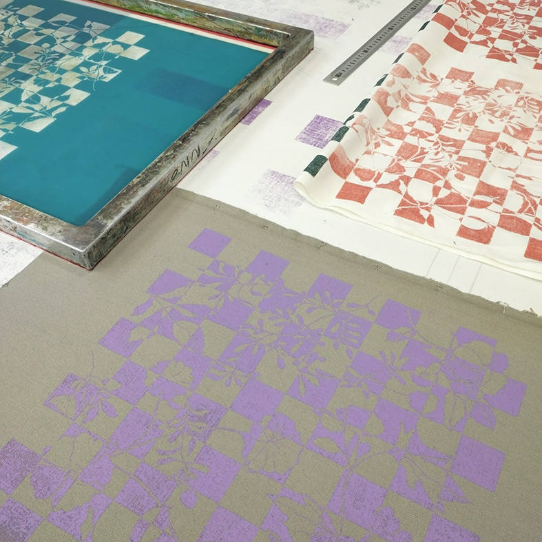
Using a squeegee, the ink is applied through the mesh – a seemingly simple process that nevertheless requires precision and consistency. Once the ink has dried and the colours have been heat-set, the designs emerge in all their vibrancy.
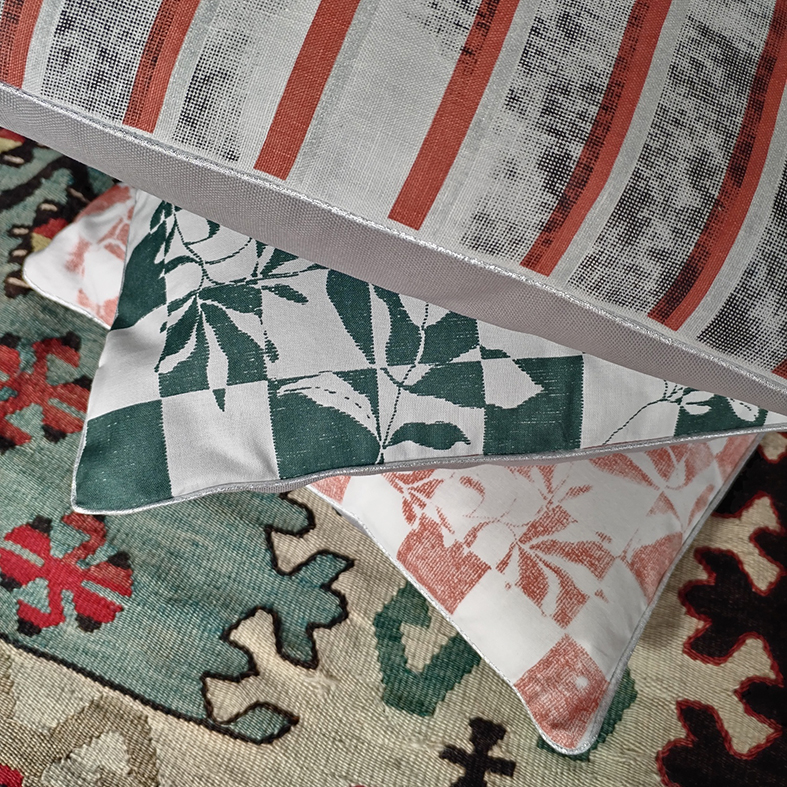
I then used my printed fabrics to make 40×40 cm cushions, finished with silver piping. It was a lovely way to bring my designs to life and turn a workshop experience into everyday objects.
This new experience has given me an even deeper understanding of the connections between design, technique and materials. Screen printing requires patience and meticulous preparation, but in return offers immense creative freedom and a unique quality, at the intersection of art and craftsmanship!
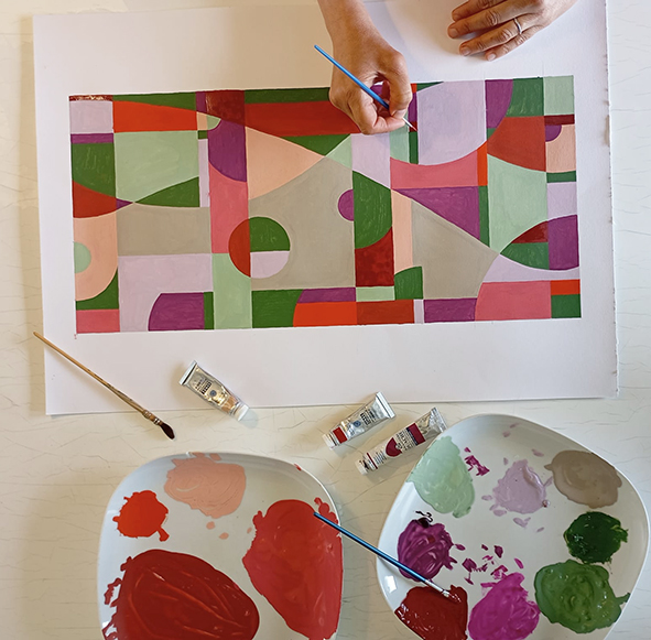
Long before I started creating repeating patterns for fashion and interior design, I was already painting as a teenager – often abstract works featuring geometric blocks of colour… I felt the urge to return to my first love!
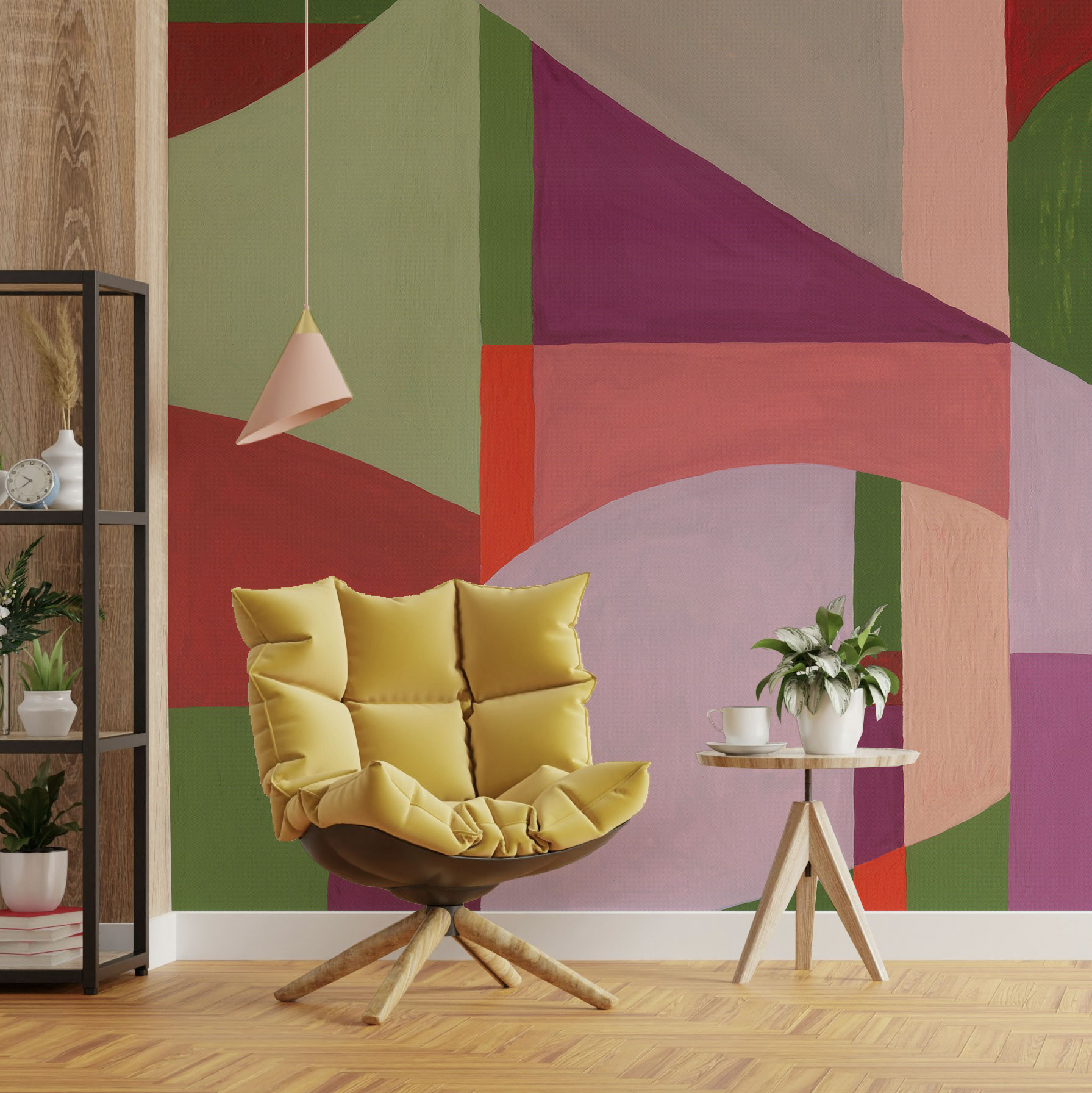
Once it was finished, I had the painting scanned in high definition so that it could be enlarged to fit an entire wall. Audrey, the project manager at Acte Déco, then came up with the idea of adding a subtle texture to it, enhancing the vintage feel of the decor.
Testing designs on different materials also allows you to compare how colours look and experiment with different scales. This gouache design then came to life on a lovely, light-and-airy square scarf – perhaps the first in a small series of scarves? Watch this space…
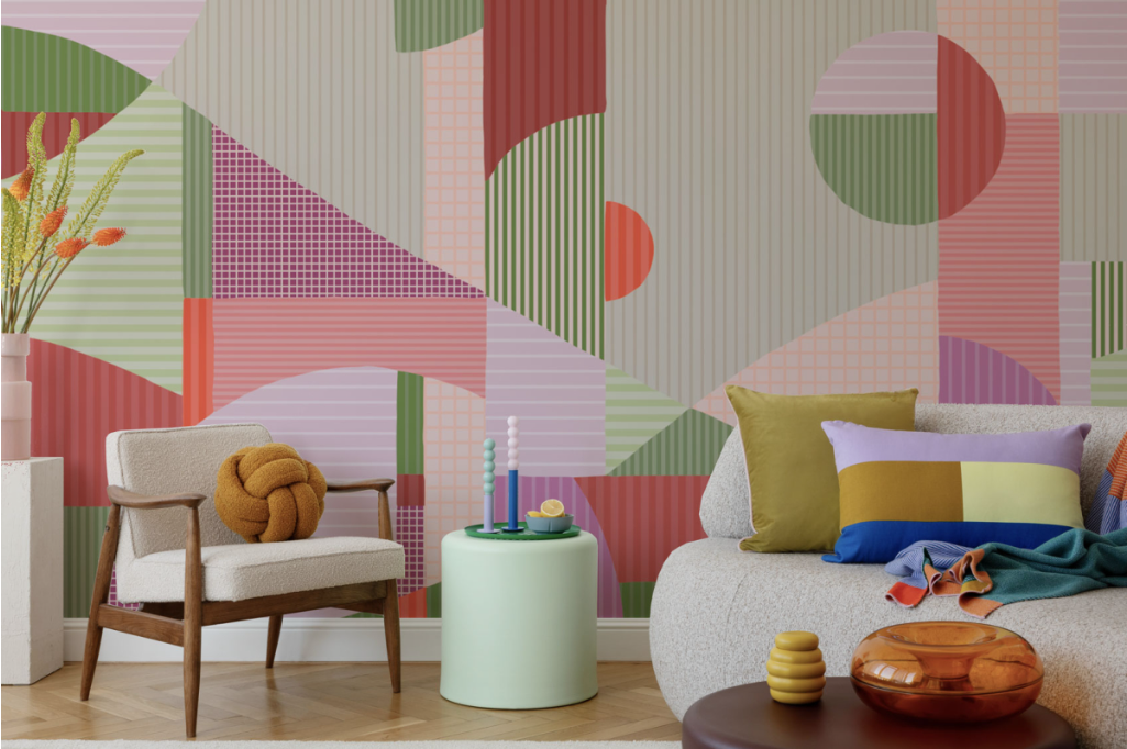
Next, I had fun layering a series of irregular stripes over the landscape, giving it an even more contemporary and graphic look. It’s always surprising to see a design take on different moods. Starting it by hand and gradually transforming it in Illustrator ultimately allows you to combine the best of both worlds!
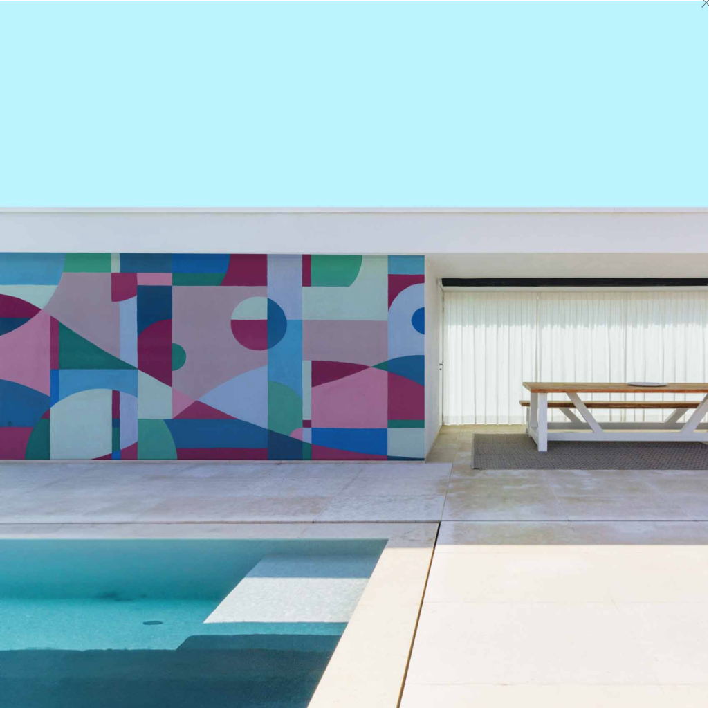
Finally, I’ve played around with the colour schemes, with each shade inviting us to journey into a different world… These linear patterns are now available in three colourways, in the original gouache-style version or a fully striped design, as interior wallpaper or even exterior wallpaper if you’ve got a swimming pool to decorate! And you, do you see a hill, a lake or an oasis?
Join us on Thursday 3 July 2025 from 6pm at the Acte Déco showroom to discover all these new wallpapers… Click here to sign up for this after-work event!
P.S.: Would you like some scarves? Let me know onInstagram 😉
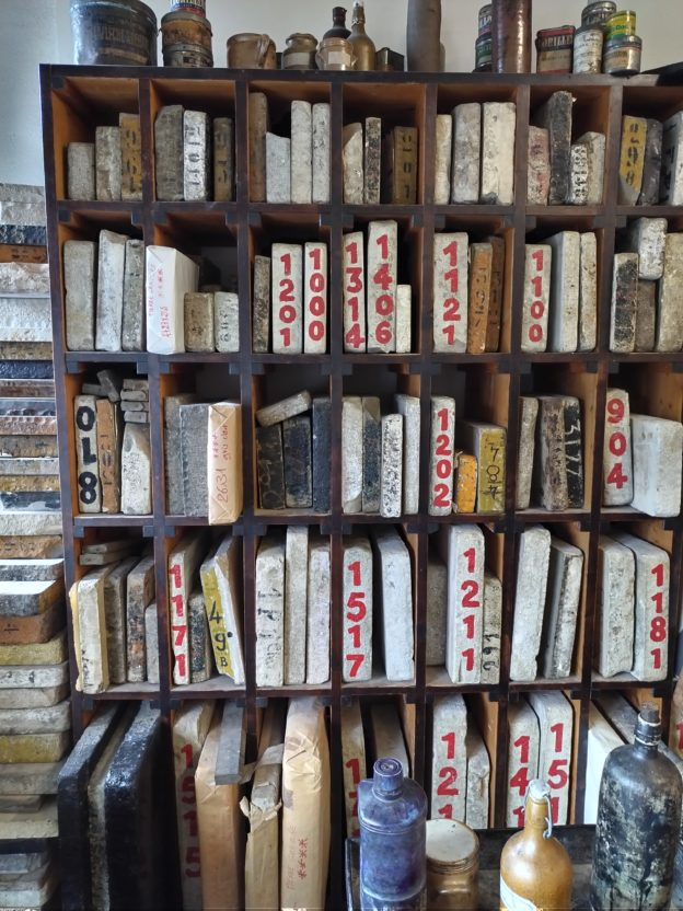
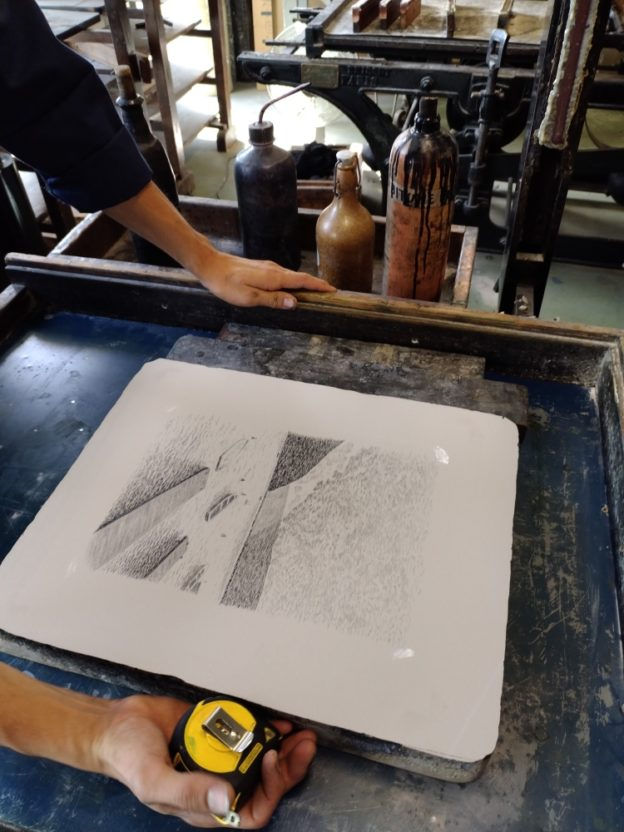
Invented in Germany in 1796, this technique for creating and printing on limestone is based on the simple repulsion between water and oil. It therefore relies solely on this chemical principle, without the need for raised or recessed engraving… I invite you to discover it at the Musée-Atelier de l’Imprimerie in Nantes!
Photo transfer: a quick win…
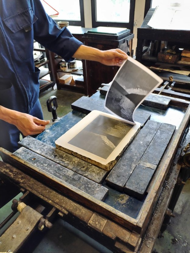
For this first attempt, I started by using one of my own photos, which I’d printed in black and white on a laser printer (using unfused toner, so the powder wasn’t set). In short, here are the steps: Coat the stone with solvent (screen wash for screen printing) using a cloth to strip away the toner. Then place the photograph face down on the stone, add a piece of cardboard to hold it in place, and use the press to transfer the image from the paper onto the limestone.
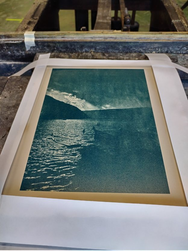
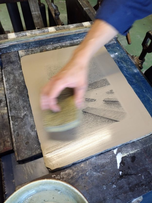
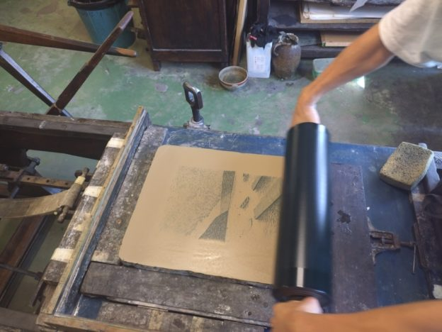
Allow to dry for 30 minutes so that the image is fully absorbed into the stone. Powder the stone with talcum powder to protect the image. Then, coat it with rosin to fix the drawing and a mixture of synthetic gum and a few drops of pure vitriol. Blot with pure water, dry, and re-talc. Coat again with acacia gum diluted in water, then with bitumen of Judea (powder diluted in turpentine) to solidify the black areas. Blot with pure water, dry, and then re-moisten. Prepare the desired color by mixing the base colors to obtain the desired shade—here, the unique color of Lake Annecy—and spread this oil-based ink onto a glass plate with a rubber roller. Moisten the stone again, apply ink, moisten, and then apply another coat of ink. Protect the sharp edges of the stone with strips of paper if necessary to avoid inking the edges and to obtain a clear print.
The traditional method, the best!
This time, we’re taking it up a notch in terms of difficulty because it involves creating directly on the limestone using an oil-based medium, but without the possibility of erasing… So I had fun redrawing the Bay of Talloires with lithographic pencils, of varying hardness (like regular pencils, which range from H “hard” to B “bold” or E “extreme,” with HB being the middle ground). It’s also possible to paint with a black oil-based ink, which can then be diluted to create washes of varying lightness, like watercolor.
Then come all the chemical operations of preparing the stone as for photographic transfer, with an even more surprising moment, since the drawing is momentarily erased by the sponge soaked in acid… You have to totally trust the lithographic experts, thanks again Noé and Philippe!
Once the stone is inked, the design reappears, as if by magic… As you can see, this technique clearly offers greater creative freedom, and it’s easy to understand why it truly revolutionized the art of engraving in the 19th century, and continues to do so today!
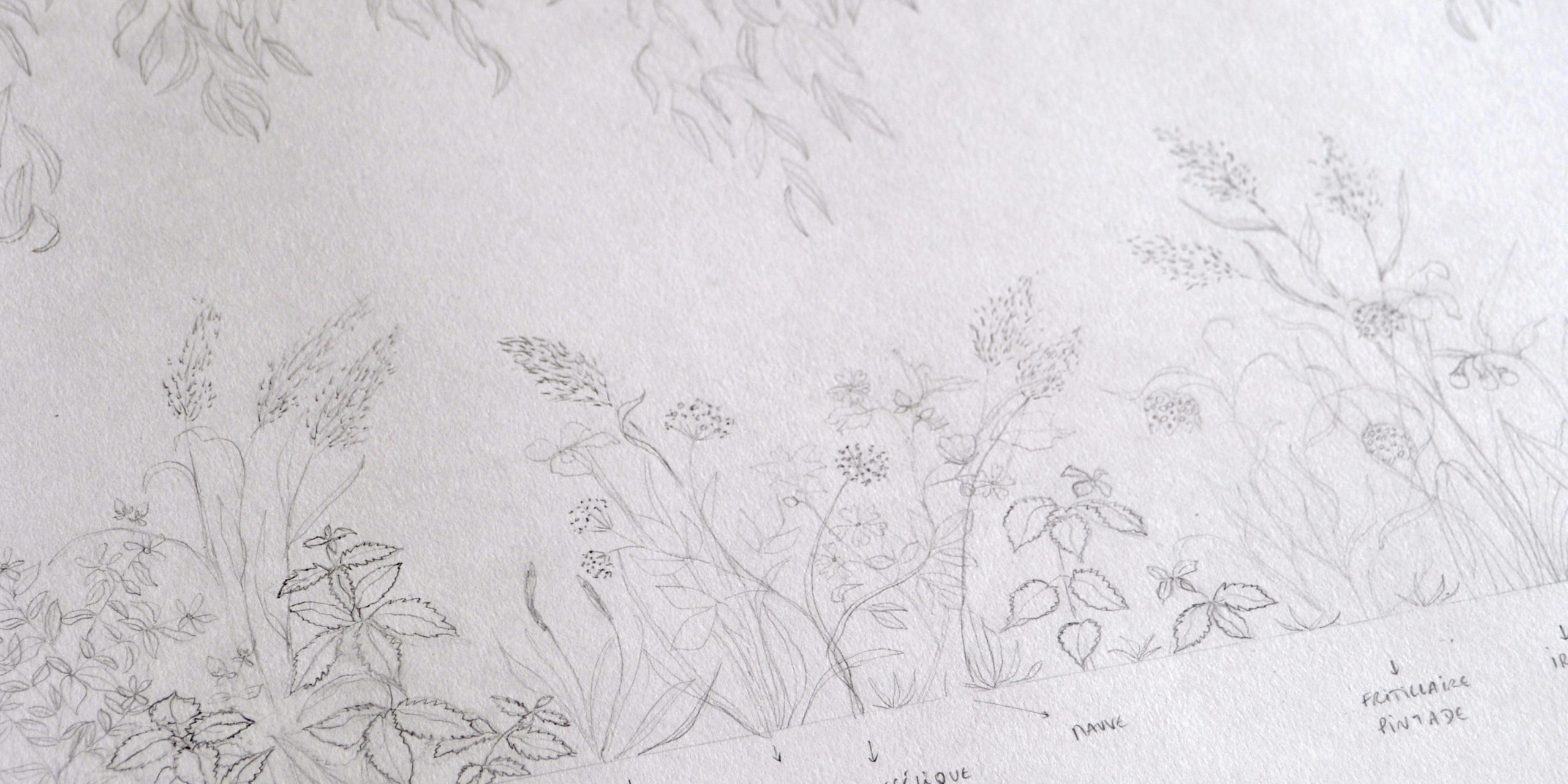
See you on Wednesday 20 September for the launch of my first panoramic backdrop, ‘Under the Canopy’, hand-designed and hand-painted, created exclusively for Acte-Déco!
A 100% NANTES-BASED TEAM Acte-Déco has been styling indoor and outdoor spaces for over 20 years, working with professionals in interior design, fit-out and architecture. Meeting Audrey and Antonin in the spring was a turning point… It felt like a natural fit, and we quickly decided we wanted to take part together in France Design Week 2023!
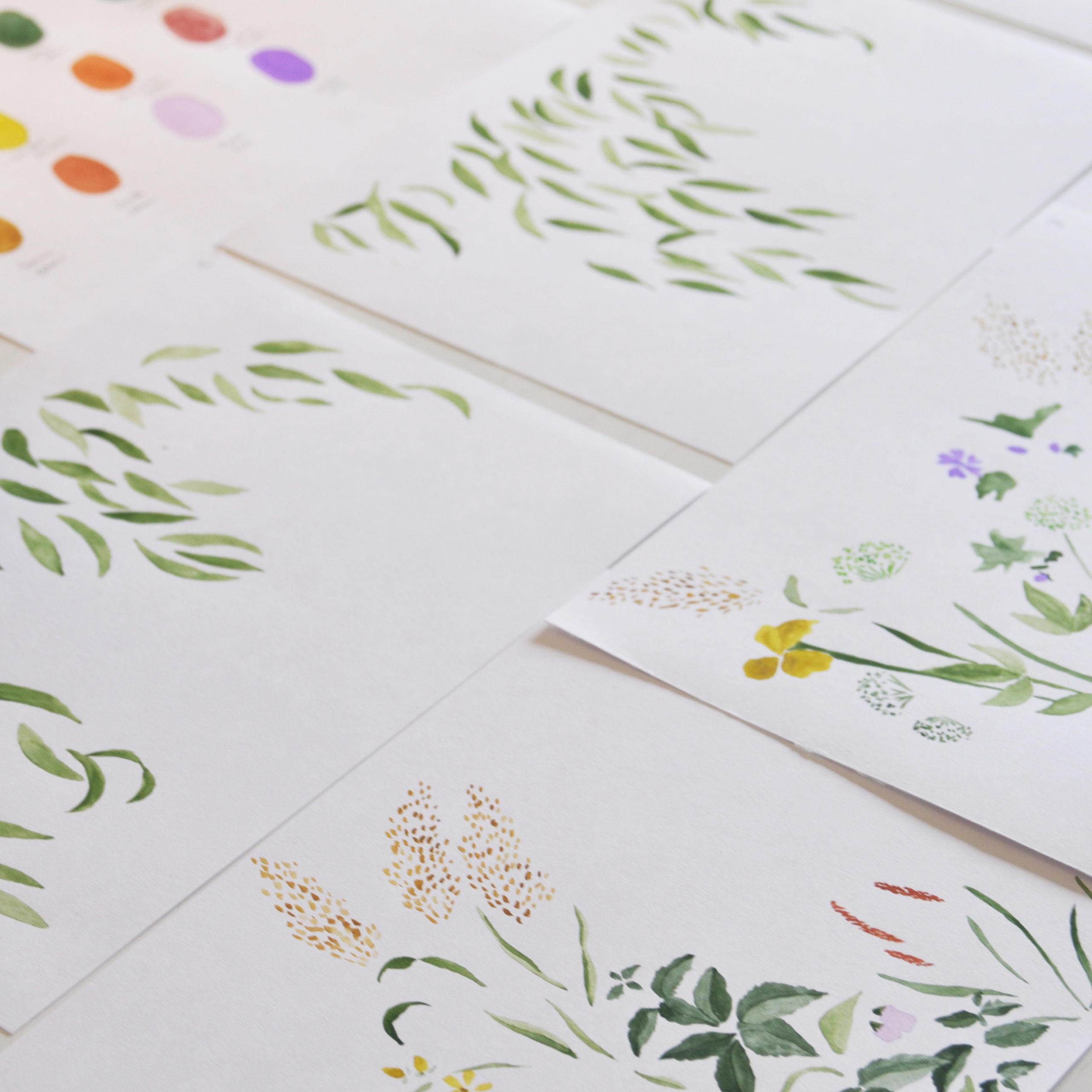
A PANORAMIC DESIGN THAT CELEBRATES NATURE Having previously focused mainly on repeating patterns for the fashion industry, I am delighted to present my very first collection of panoramic wallpapers for Acte-Déco! Inspired by the wild plants found along the banks of the Loire and the Chézine, I developed the colours using handcrafted watercolours created during an Octarine workshop in Nantes. This design is also an eco-friendly product: printed locally, using water-based or UV-cured latex inks, and made to order.
COME AND TAKE A PEEK BEHIND THE SCENES! Join us on Wednesday 20 September from 5pm to 7pm to find out how this design came about… I’d love to meet you and answer any questions you may have! The creative process will unfold before your eyes: from the mood board to the first sketches, and then the application of this design on various materials: exterior wallpaper, non-woven wallpaper, window decals… Do come along!
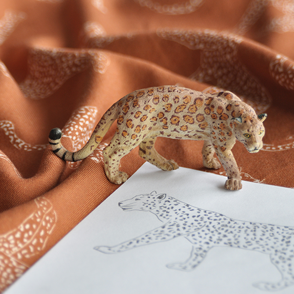
When Laetitia, aka ‘Poulette in the city’, asked me to design the patterns for her fabric collection, I jumped at the chance! As we’re both from Nantes, we had a few mutual friends who’d already brought us together on creative projects and at craft fairs…
Laetitia had a very specific vision right from the start: an all-over leopard print – her favourite animal – on a caramel background, a trendy, warm shade, perfect for adding warmth to our winter outfits! She wanted to see feline silhouettes depicted from different angles, all sharing the speckled pattern of their coats to create a camouflage effect. The idea was to combine a fairly detailed pattern with a two-tone colour scheme for a graphic effect reminiscent of jacquard… Naturally, I therefore opted for a pencil sketch of the six leopards, followed by a pattern repeat in Illustrator, starting with a dense version and then a more open one.
It is this latest version that you can now see, printed in France on a beautiful opaque viscose, available to view on my Insta
Stay tuned – over the next few days I’ll be revealing the steps involved in creating this first collection, from the initial brief to the sewing of the fabrics!
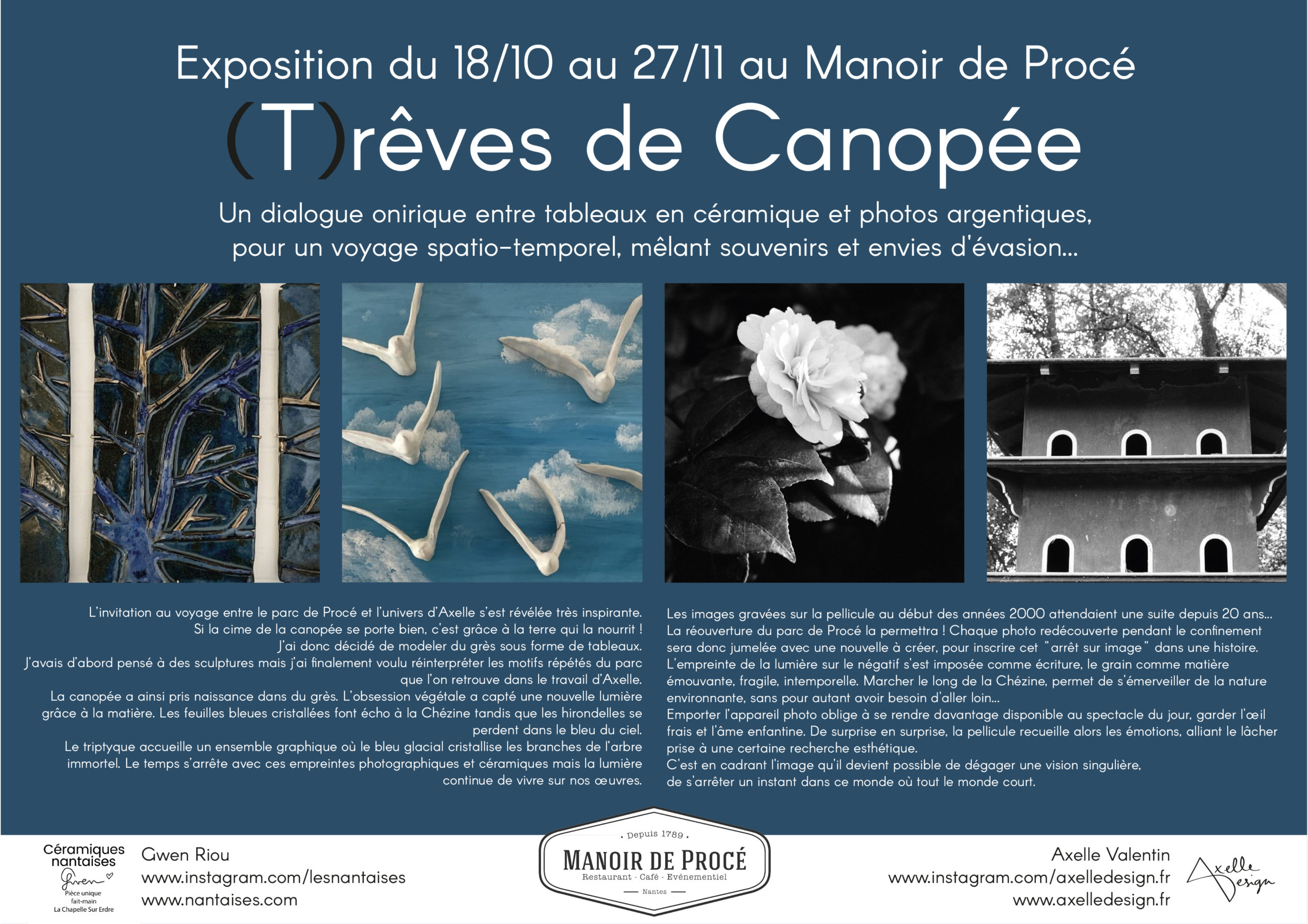
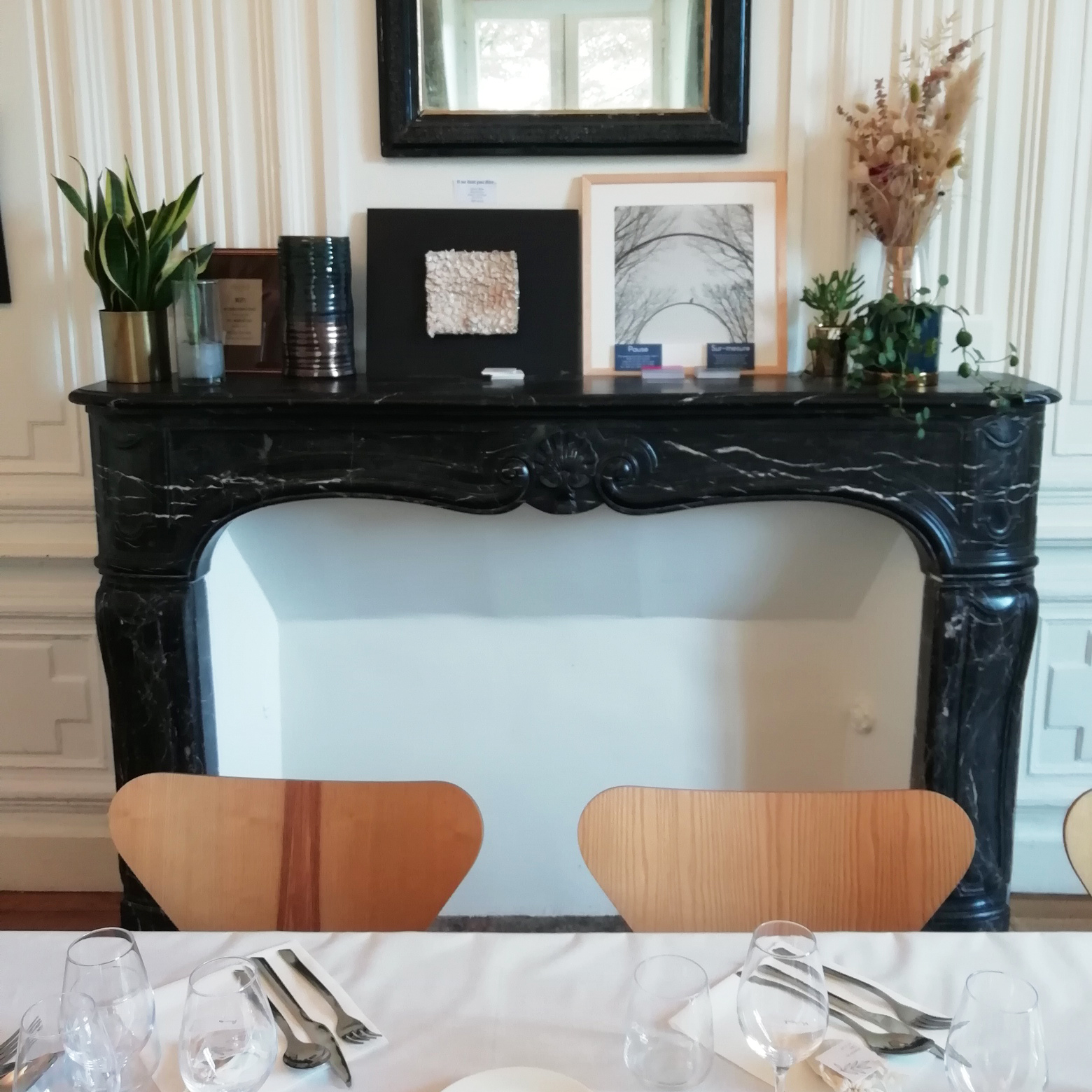
Join us on Sunday 27 November from 4pm to 7pm at the Manoir de Procé for a friendly get-together at the heart of our exhibition, and a journey through space and time… Come and discover Gwen’s ceramic paintings and my film photographs… why not get a head start on your Christmas gifts with these original, locally made pieces?
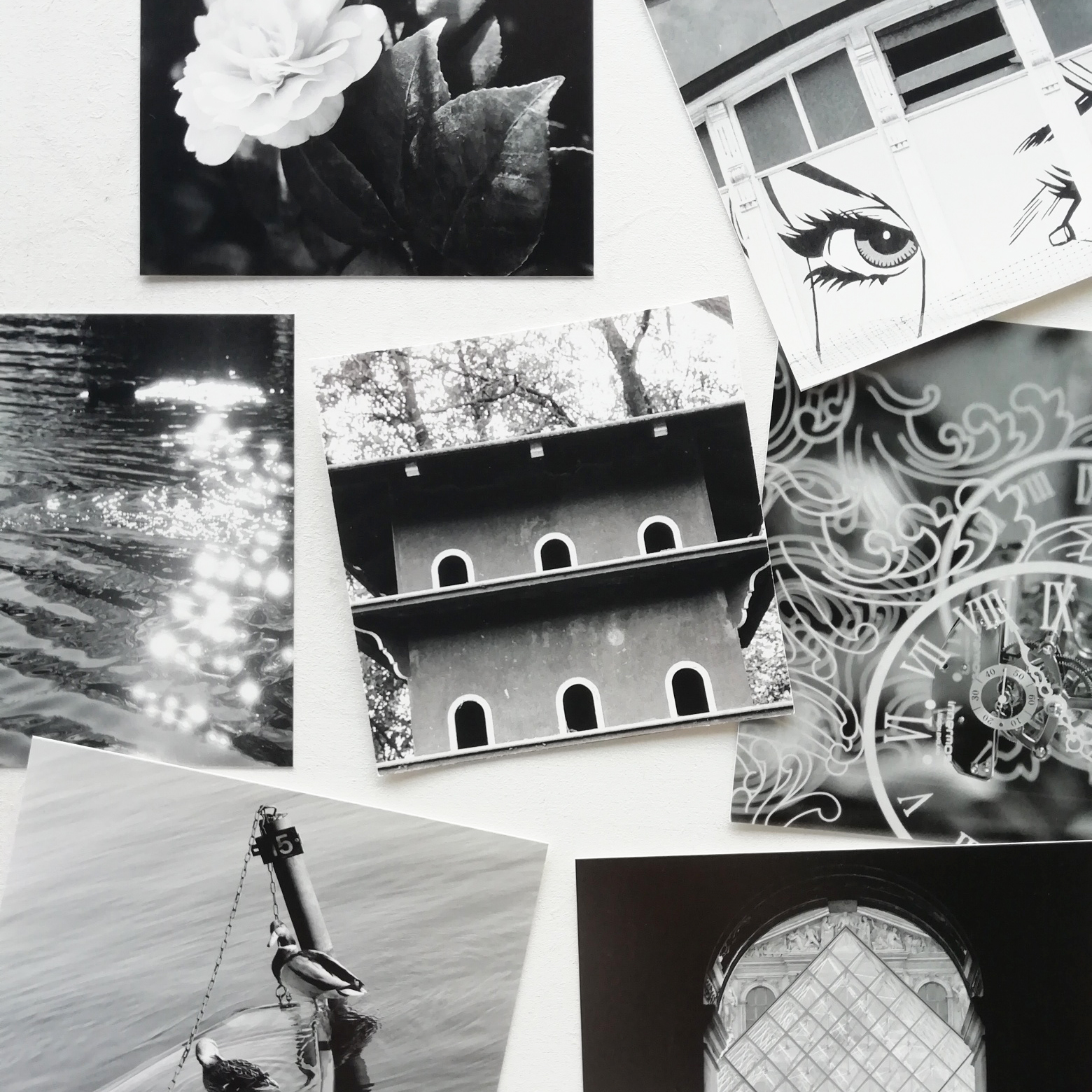
The images captured on film in the early 2000s have been waiting for a sequel for 20 years… The reopening of Procé Park will make this possible! Each photo rediscovered during lockdown will therefore be paired with a new one to be created, so as to weave this ‘freeze-frame’ into a story. The imprint of light on the negative has established itself as a form of writing, the grain as a moving, fragile, timeless material. Walking along the Chézine allows one to marvel at the surrounding nature, without needing to go far… Taking the camera along forces one to be more open to the spectacle of the day, to keep a fresh eye and a childlike spirit. From one surprise to the next, the film captures these emotions, blending a sense of letting go with a certain aesthetic quest. It is by framing the image that one can reveal a unique vision, pausing for a moment in this world where everyone is rushing about.
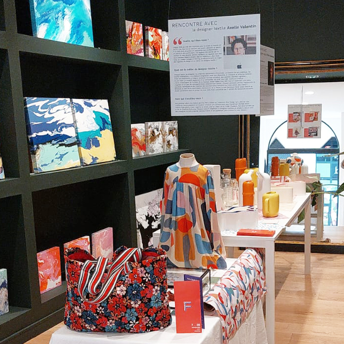
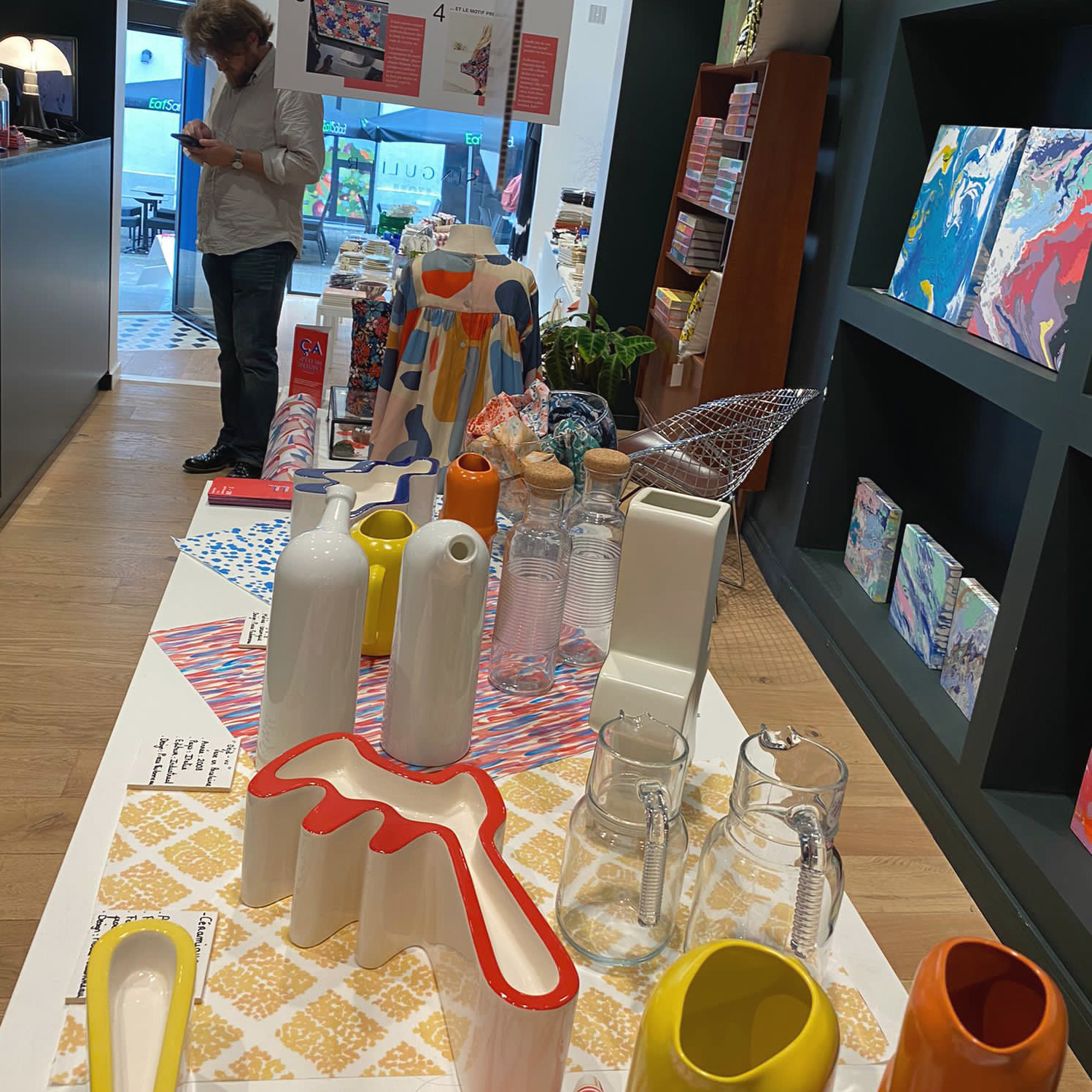
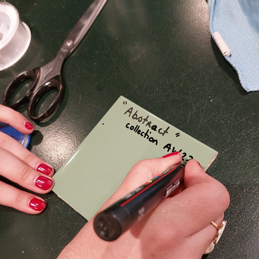
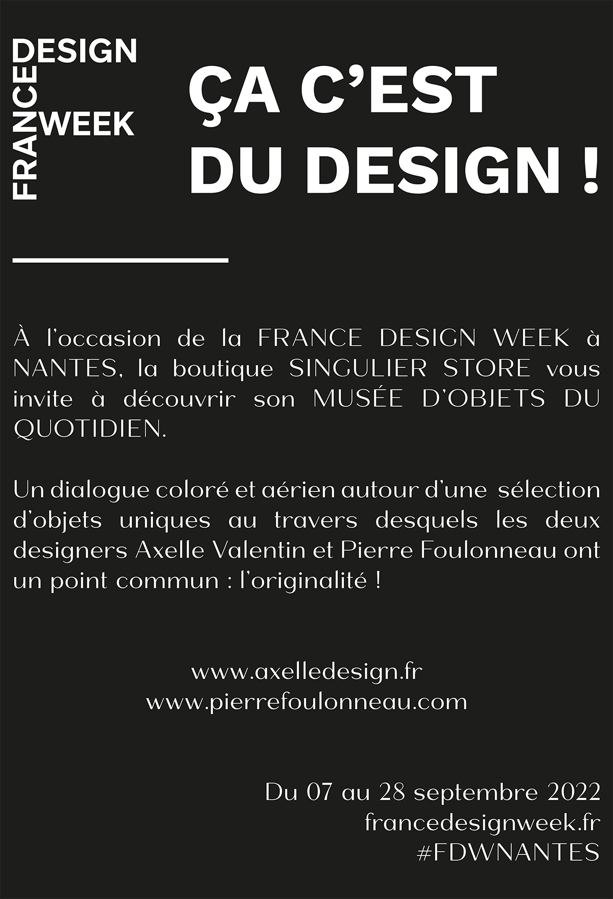
From 7 to 28 September, France Design Week returns to #Nantes to showcase and celebrate #design across the region… Thank you, Maxime, for inviting me to this third edition of #FDWNANTES in Nantes! In turn, I’m delighted to invite you to discover this dream installation, conceived, printed, laid out and cut out this summer… and just hung up with Albane & Pierre. We wanted it to be both educational and fun. See you at Singulier store, 28 Rue Scribe in Nantes, just a stone’s throw from Place Graslin!
Take a look behind the scenes at the designs created for the lovely Basque brand ‘Arsène & les pipelettes’ for the AW2324 collection!
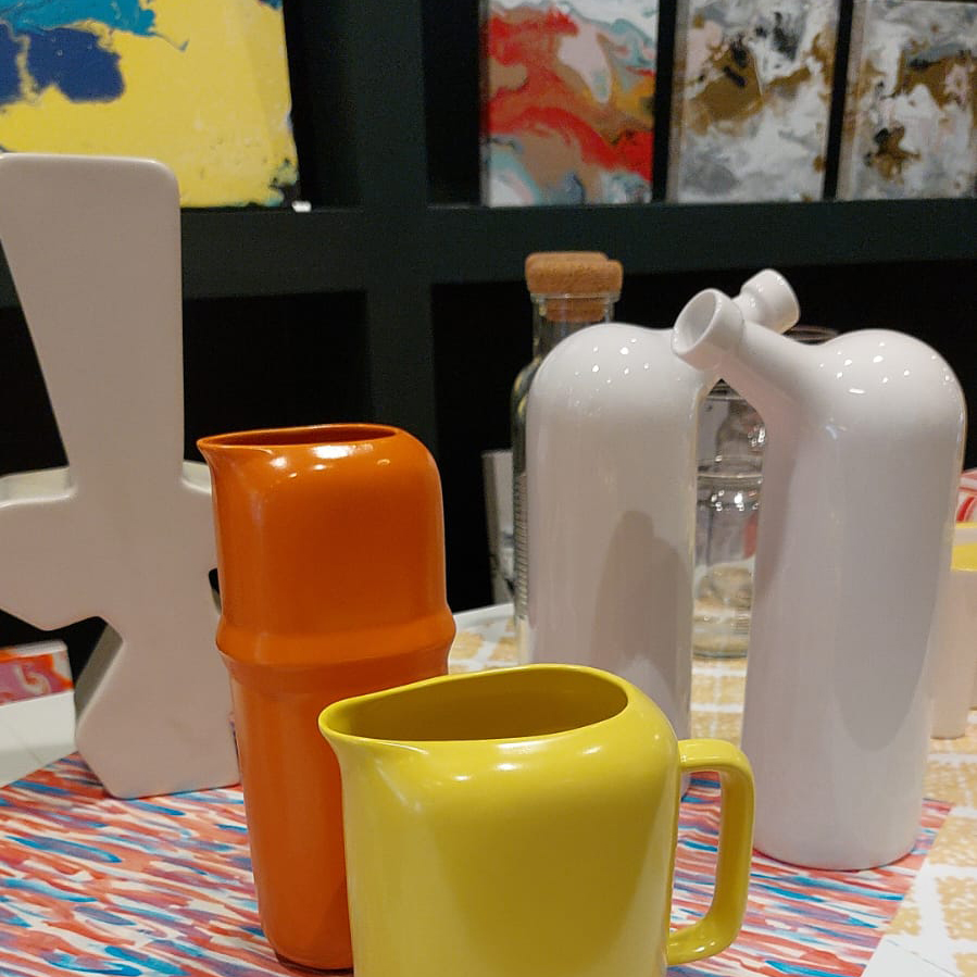
Pierre Foulonneau will also explain how he designed and created these unique ceramics, which were cast in Italy…
Albane, the museum guide, will show you round our museum of everyday objects…
… a vibrant and light-hearted interplay between industrial design, textile design and artists’ canvases!